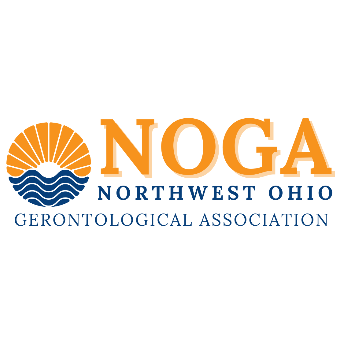
I’m excited to share NOGA’s new look. This update gave the brand a modern look while honoring its history and mission.
What We Transformed
1. A Refreshed Logo That Honors Purpose
NOGA’s logo was redesigned to better reflect its mission. Modern typography brings professionalism and warmth forward, showing NOGA’s important role in aging services across Northwest Ohio.
2. Streamlined Site Navigation for Improved Access
The homepage is now organized into clear categories: About, Membership, Sponsorship, Resources, Events, Advocacy, Scholarships, and Awards. Visitors can find information quickly and easily.
3. Elevated Visual Branding and Imagery
The homepage features real, engaging images that highlight community events and the people behind NOGA’s mission.
4. Strengthened Messaging That Connects
The copy now reflects NOGA’s core belief that aging is something to honor, not fear. Calls to action are clear: Become a Member, Get Involved, Donate. This makes engagement with the organization easier and more inviting.
5. Built to Scale with Purpose and Flexibility
This redesign is built for growth. Adding future events, resources, or advocacy efforts is simple and seamless.
The Real Impact: Refreshing Noga’s LOOK: A REBRAND
- Sharper identity: NOGA is now instantly recognizable for its mission-driven focus.
- Enhanced usability: Caregivers, members, and sponsors can engage without confusion.
- Deeper connection: Every headline, image, and button reinforces dignity, support, and community.
- Ready for growth: The brand foundation is strong enough to expand with NOGA’s future.
Why It Matters
For 58 years, NOGA has been a trusted resource for professionals and advocates serving older adults. These updates do more than modernize the look. They amplify NOGA’s presence and invite meaningful connections throughout Northwest Ohio.
Here’s to honoring NOGA’s legacy and building its future!


Leave a Reply